Clear information structure
Visitors can understand programmes, outcomes, duration and next steps without feeling overwhelmed.
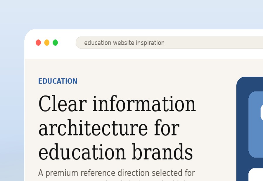
Education demo concept
This refined education concept is designed to reduce confusion, build trust and guide visitors toward the right programme or enquiry path. It helps your offer feel more established, organised and easier to believe in.
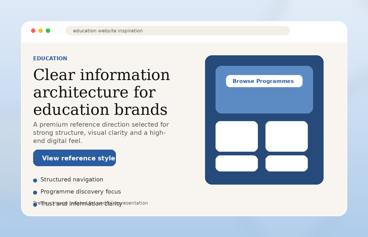
What this concept focuses on
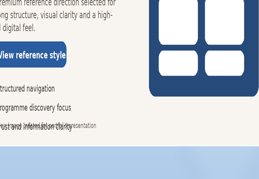
Visitors can understand programmes, outcomes, duration and next steps without feeling overwhelmed.
A more serious first impression for parents, learners, corporate clients and partners.
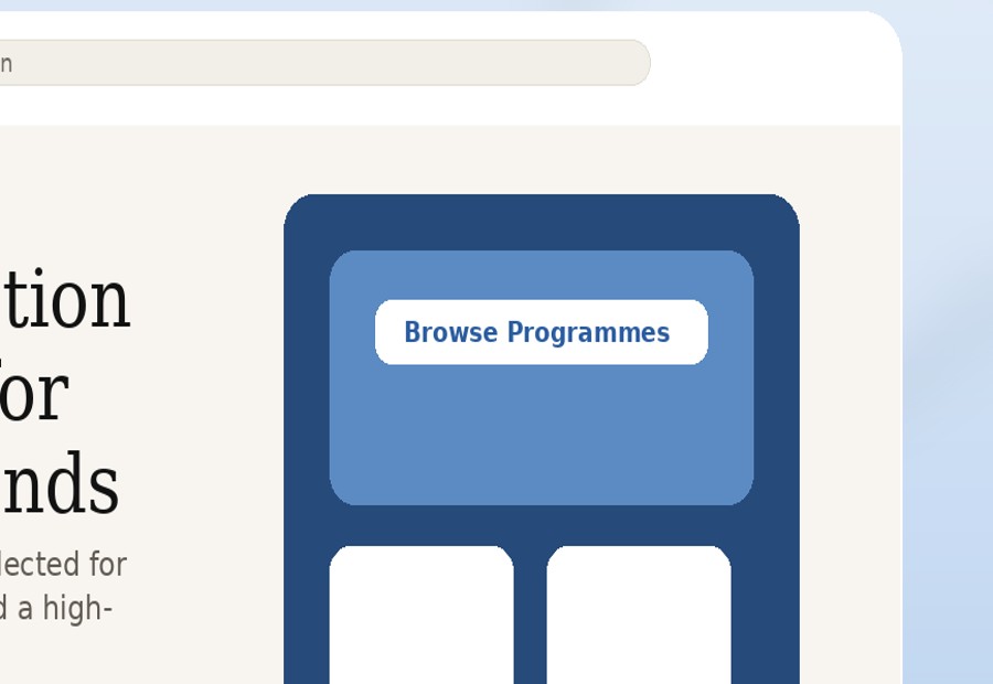
Clear CTA paths for counselling, brochure requests, programme questions or direct WhatsApp enquiries.
Education website strategy
Education decisions are emotional and practical at the same time. People need to feel that the institution is serious, organised and capable before they submit an enquiry.
Programme pages should answer the visitor’s real questions before they need to ask.
A clean journey makes the organisation feel more established and professional.
When programmes are explained clearly, enquiries become more serious and easier to handle.
Programme presentation
Education websites work best when they explain offers clearly. This type of structure makes it easier to display courses, durations, target students and learning outcomes.
Example programmes section
8-week programme for working adults who need more confidence in meetings, presentations and client communication.
Hands-on introduction to content, social media, campaigns and performance tracking for beginners.
Customer service, front office, communication and workplace readiness for hotel and F&B careers.
Structured language training with clear progression for learners preparing for study or professional pathways.
Conversion thinking
For education providers, the website must do more than look nice. It should help visitors choose a programme, understand the pathway and feel comfortable asking for guidance.
“Now I understand what they offer and which programme could fit me.”
Programme cards make offers easier to compare.
Outcome-focused copy explains why the programme matters.
Trust sections support credibility before the enquiry.
WhatsApp counselling CTA makes the first conversation easier.
Mobile-first layout helps students and parents browse naturally.
Suggested page structure
Main offer, value proposition and primary enquiry route.
Clear list of courses, pathways or academic offerings.
Trust signals, teaching quality, student support and outcomes.
Lead form, brochure request or WhatsApp counselling button.
Next step
Send your programme list, prospectus or current website. I can help turn your courses into a clearer, more trusted website structure that makes enquiries easier.