Brand-first visual feel
A warm, minimal visual language that makes the café feel intentional, memorable and worth visiting.
Café demo concept
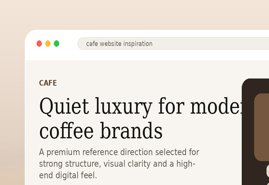
This refined café concept is built around one goal: make the brand feel desirable, make the menu easy to understand, and make the next step effortless — whether that is visiting, reserving or messaging on WhatsApp.
What this concept focuses on
A warm, minimal visual language that makes the café feel intentional, memorable and worth visiting.
Signature drinks, best sellers and pricing presented clearly so customers do not need to search or ask basic questions.
Location, reservation and WhatsApp actions placed where customers naturally decide to take the next step.
Café website strategy
A premium café website should sell more than coffee. It should sell atmosphere, taste, identity and the feeling of wanting to be there. The goal is to make the customer think: this place looks worth visiting.
Strong visuals create appetite and curiosity before the customer even reads the menu.
Clear menu, location and opening hours reduce questions and make visiting easier.
A polished website helps the café feel like a destination, not just another coffee shop.
Visual storytelling
For cafés, strong visuals matter. This kind of structure gives space for interior shots, hero drinks, ambience and signature products so the website feels closer to the real brand experience.
Conversion thinking
For café customers, the decision is often quick. They want to see the vibe, check the menu, know the location and act fast. A good website removes hesitation.
“It looks like a place I would actually want to visit.”
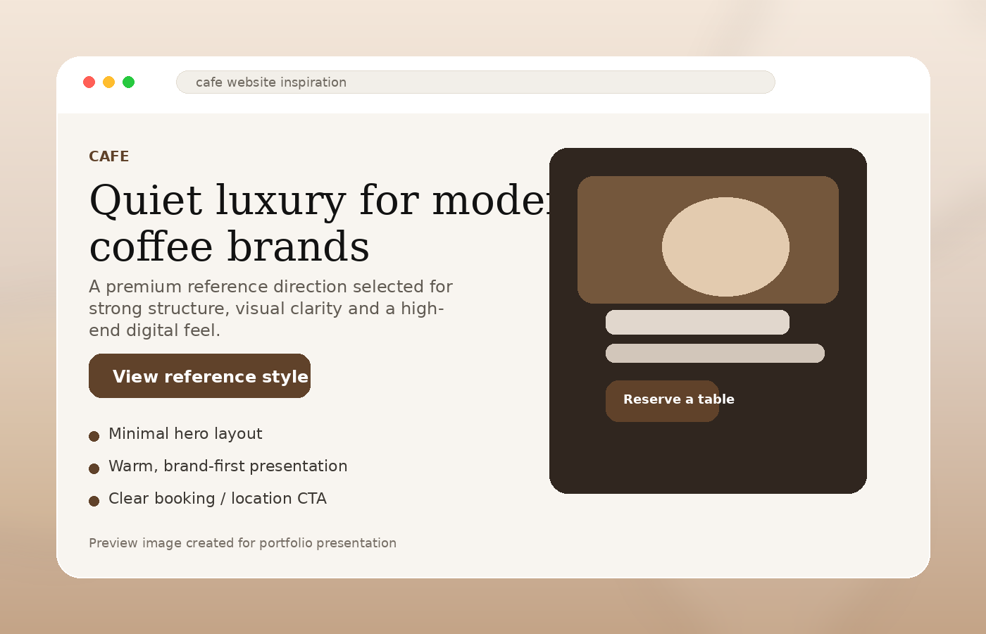
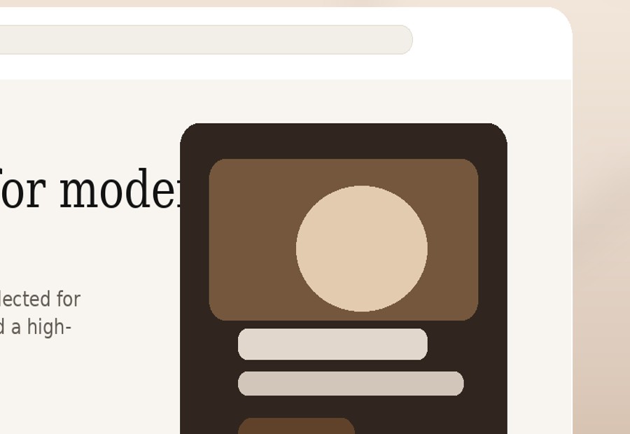
Hero section creates immediate appetite and brand feeling.
Menu highlights answer the customer’s first practical question.
Gallery sections show atmosphere and social appeal.
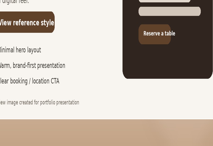
Location and WhatsApp CTA make the next step simple.
Mobile layout keeps the experience smooth for customers browsing on the go.
Suggested page structure
Strong brand image, short message and CTA to reserve or get directions.
Signature drinks, best sellers and featured food items with pricing.
Interior shots, ambience and café culture presentation.
Location, opening hours, contact and WhatsApp booking button.
Next step
Send your café name, Instagram page or current website. I can show you how to turn your atmosphere, menu and brand story into a website that feels premium and brings customers closer to visiting.